Brand Identity System | Website Design

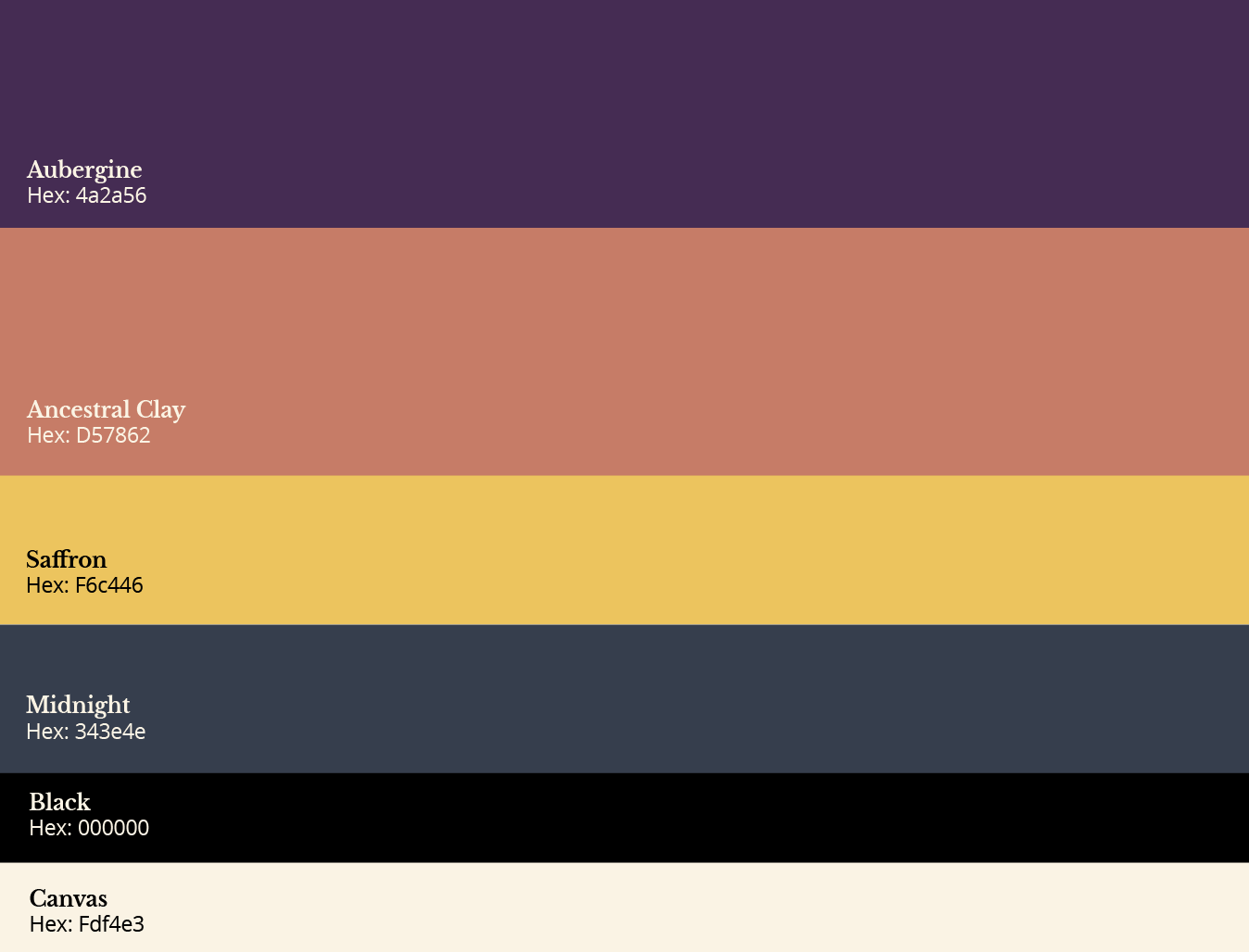
In the development of the brand identity for the Collaboratory for Black Poiēsis, a deliberate and thoughtful color palette was selected, drawing inspiration from the vibrancy, depth, and nuances of the organization’s mission. These shades harmoniously interact, representing a blend of tradition, introspection, and forward-thinking.
PRIMARY COLORS
Aubergine: This deep, rich purple serves as a cornerstone of the palette, encapsulating both the depth and the expansiveness of the brand. This color provides a mature foundation for the palette, representing thought and creativity.
Ancestral Clay: This warm, muted coral tone adds a touch of vibrancy and energy to the brand. It has a natural ability to soften the edges of more pronounced colors and adds a touch of organic charm.
SECONDARY & NEUTRAL COLORS
Saffron: This vibrant yellow stands as an invigorating representation of optimism and creativity. Acting as an accent brings life and energy, creating a visual focal point in design applications. Midnight: This muted blue-grey provides a cool contrast to the warmth of Ancestral Clay and Golden Dawn. As a neutral, it offers a calming and balancing presence. More than just a background shade, this blue-grey suggests both history and the vast potential of Black art and thought. As a neutral in the palette, it ensures the balance and equilibrium of the bolder colors. Black: A classic, deep black that serves as an anchor for the palette. It introduces a touch of formality and a sense of strength, sophistication and authority.
Canvas: Evocative of aged paper, this gentle off-white provides a backdrop for storytelling. It allows the more assertive shades in the palette to take the foreground, while offering a soft, supportive presence.
Together, this ensemble of colors does more than create visual appeal. They form a symphony, each note adding depth and resonance, perfectly harmonized to represent the ethos of the Collaboratory for Black Poiēsis. Their interplay and balance is a testament to the multifaceted nature of the organization—rooted yet forward-looking, deep yet luminous.
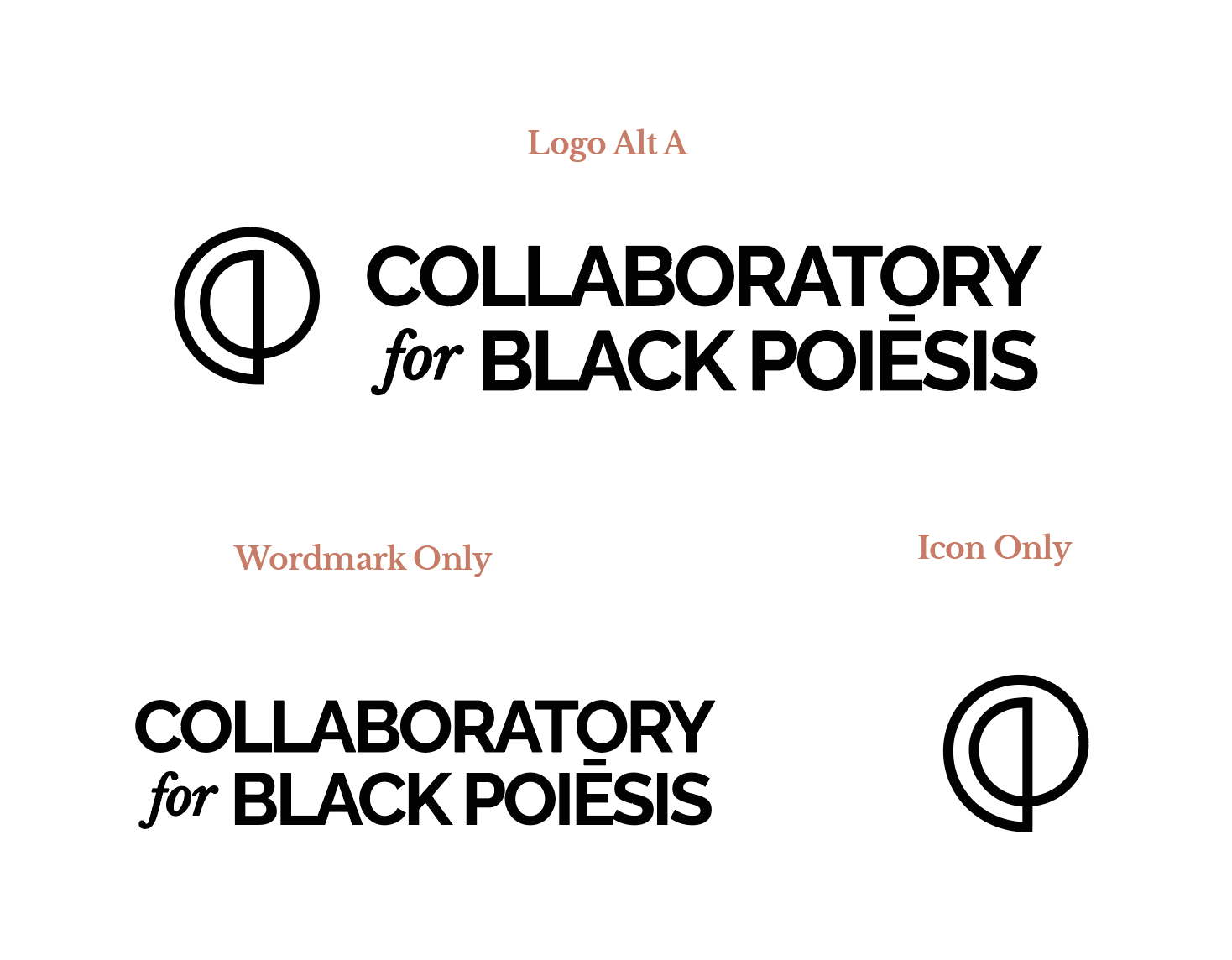
For the logo icon, we drew inspiration from historical archives and ancient visual languages.
Central to this design is a graceful curve that sweeps downwards, stemming from the left of a vertical line, only to circle upwards and find its resolution at the line’s base. This form was inspired by the nsibidi prototype for “trek”—an emblematic representation of movement, journey, and passage.
The vertical line stands as a symbol of stability and continuity, representing the unwavering commitment of the Collaboratory for Black Poiēsis to its foundational principles. In contrast, the curve tells a story of the journey, of transitions and transformations, reminiscent of the migratory patterns and shared journeys of Black peoples across time and place.
This “trek” is not just a physical journey. It symbolizes the intellectual, artistic, and cultural voyage that Black artists and thinkers undertake, continuously pushing boundaries, innovating, and reinventing, while staying deeply connected to their roots.
Functionally, the logo embodies versatility. Its streamlined design ensures clarity and distinction. Additionally, by grounding the identity in the symbolic language of nsibidi—a pre-colonial system of communication among the Efik and Ejagham peoples of Nigeria—it fuses antiquity with modernity. This makes the logo a testament to the organization’s ethos of celebrating the depth of Black history while looking ahead to infinite possibilities.


In designing the wordmark for the Collaboratory for Black Poiēsis, clarity and functionality took center stage.
At its core, the wordmark adopts a stacked layout. “Collaboratory” is prominently positioned on top, employing the clean lines and bold weight of Raleway. This font, chosen from the vast Google font library, offers crisp legibility at various sizes, ensuring that the primary identity of the brand is always discernible, even in reduced dimensions or when juxtaposed against busy backgrounds.
Below it, we introduce a touch of contrast. The term “for”, italicized and set in Libre Baskerville, brings in a subtle softness, serving as a bridge between the dominant elements of the wordmark. This design nuance, inspired by the wordmark of the National Museum of African American History and Culture, introduces a slight classic touch to the overall modern aesthetic, creating a balanced visual hierarchy.
Lastly, “Black Poiēsis” parallels the strength of “Collaboratory”, standing tall in the same Raleway typeface. The choice of all caps for these elements provides a sense of cohesion and authority, ensuring that the organization’s full name carries weight and importance.


TYPOGRAPHY SELECTION FOR THE COLLABORATORY FOR BLACK POIĒSIS
In curating a typography suite for the Collaboratory for Black Poiēsis, we prioritized clarity, legibility, and an aesthetic resonance that would align with the organization’s ethos. Our selection is rooted in combining tradition with modernity, mirroring the organization’s embrace of both historical and forward-thinking perspectives.
LIBRE BASKERVILLE
We’ve selected Libre Baskerville for titles. Originating from the classic Baskerville typeface, which dates back to the 1750s, Libre Baskerville carries an air of authority, reliability, and timelessness. Its refined serifs and balanced structure make it an excellent choice for headings, ensuring that titles capture attention while exuding sophistication.
RALEWAY
Complementing our primary typeface, Raleway has been chosen for subtitles. With its elegant, sans-serif design, Raleway introduces a touch of modernity. Its clean lines and uniform strokes provide a contemporary counterpoint to Libre Baskerville, ensuring that subtitles are not only distinctive but also foster a sense of hierarchy in the content.
OPEN SANS
For body text, we’ve opted for Open Sans. Praised for its neutral yet friendly appearance, Open Sans ensures optimal legibility across various platforms, be it print or digital. Its open forms and clean curves create a comfortable reading experience, making it ideal for communicating longer, detailed messages.


