In the process of developing the new brand identity system for the Corbin Hill Food Project, we recognized the potency and expressiveness of some of the original color palette. These colors truly capture the essence of the brand, painting a vibrant picture of its mission, values, and work. To streamline communication and enhance the memorability of each hue, we’ve taken the initiative to expand the color palette and assign each color a distinct, evocative name. This system not only facilitates easy referencing but also deepens the symbolic connection between each color and the brand’s narrative.
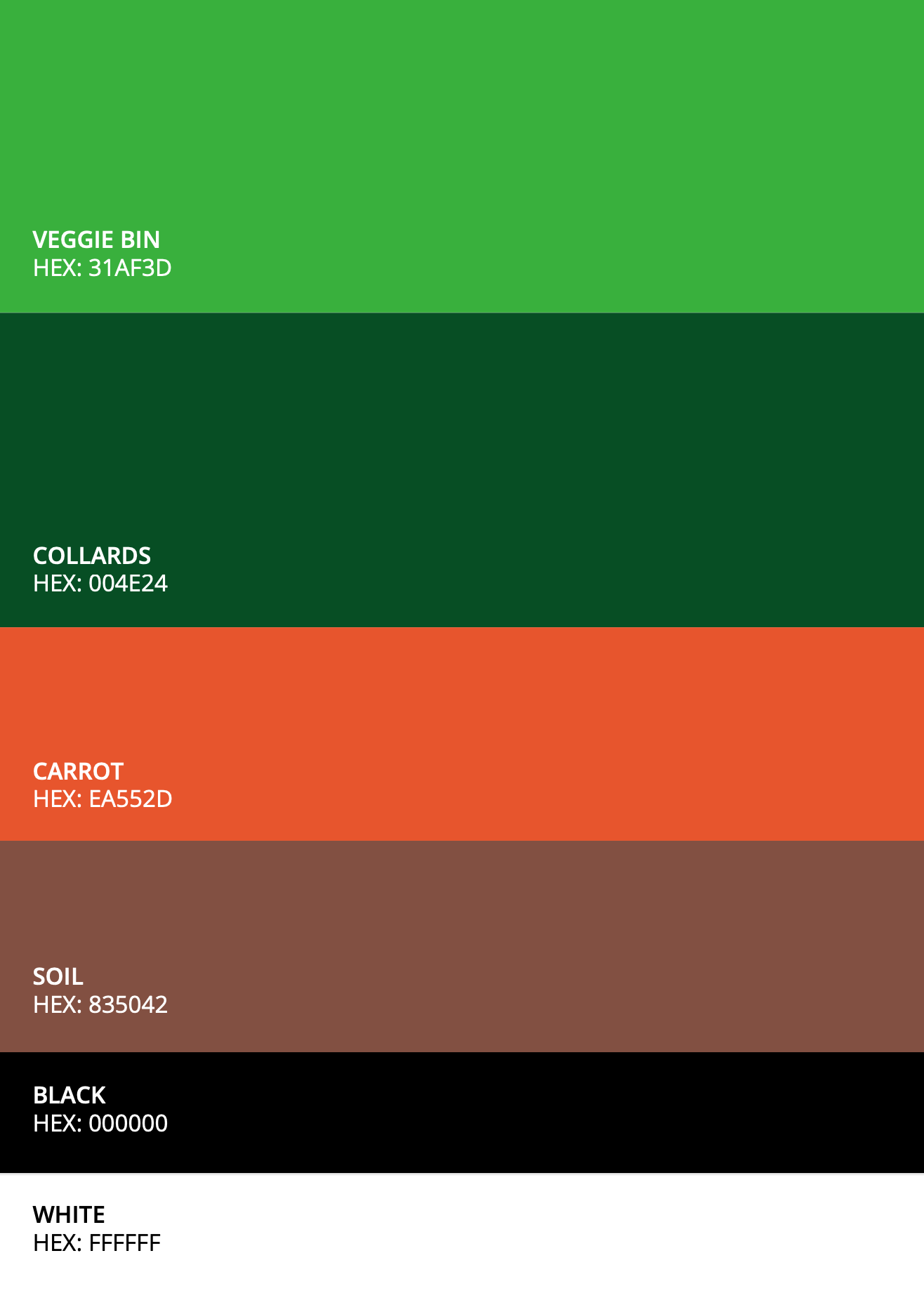
Primary Colors
Veggie Bin is a vibrant shade of green. It evokes freshness and growth, often associated with nature and healthy foods. This vibrant hue has the capacity to draw attention and reflect the energetic, positive impact of CHFP’s work.
Collards is a deep green evoking feelings of resilience, stability, and growth. It draws upon the very essence of nature, promoting balance and tranquility. Just as this color embodies the renewing energy and wholesome vitality of nature, it reflects CHFP’s commitment to nurturing a resilient, harmonious, and sustainable food ecosystem.
Secondary & Neutral Colors
Carrot is a lively, warm color that spotlights the vibrant and dynamic aspects of CHFP’s operations. This bold, inviting shade provides visual contrast and energy, and captures the sense of joy and dignity that CHFP instills through its work
The inclusion of black and white in the palette plays a critical role. Black intensifies the depth and impact of the vibrant shades, while white forms a pristine backdrop, allowing these colors to stand out. Collectively, they provide harmony to the CHFP color palette.