Brand Identity System | Website Development

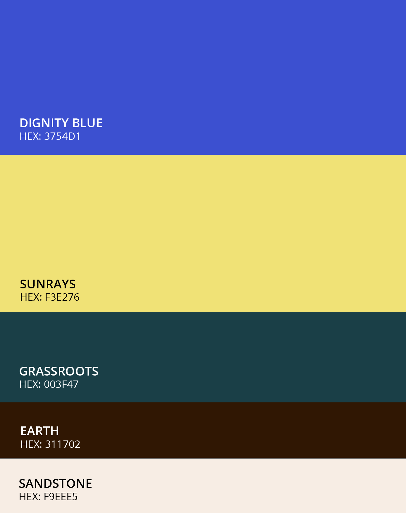
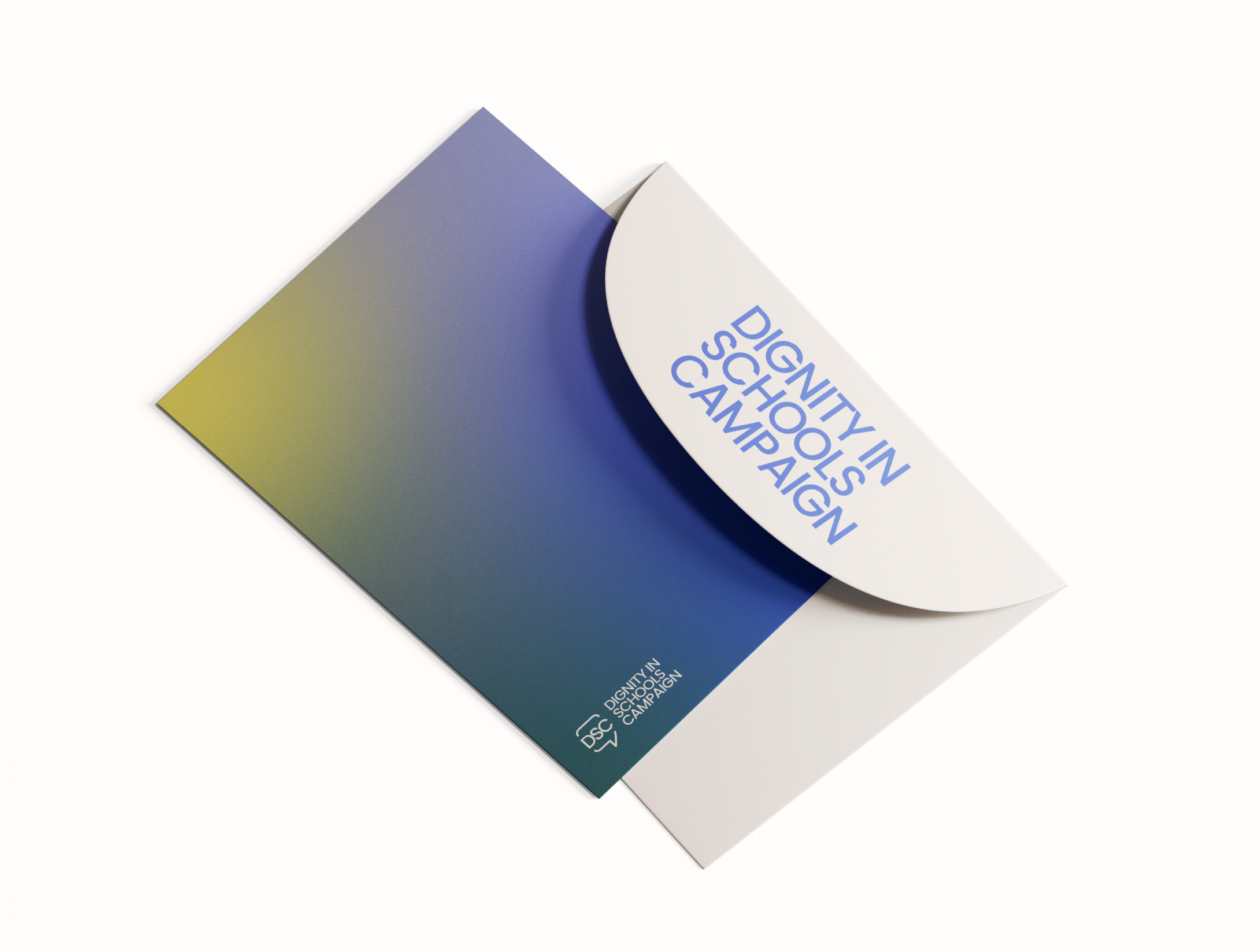
We explored a range of muted, neutral, and vibrant hues to determine the best color palette for your brand. After conducting extensive research into the color associations and psychological effects of various hues, we carefully selected five colors that are complementary to each other. Our goal was to incorporate a color palette that gave your brand identity system a cohesive and visually-striking appearance to help your brand stand out and make a positive and memorable impression.

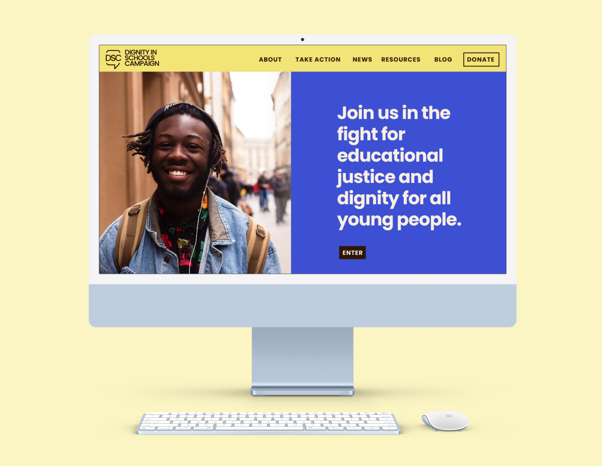
The colors we chose are not only visually pleasing, but they also carry significant emotions and messages. The primary color, Dignity Blue, conveys trust, reliability, and stability, consistent with the campaign’s aim of creating positive alternatives to a punishment-based culture and reforming public schools. Sunrays represents optimism and warmth, aligning with the organization’s goal of empowering parents, youth, and educators to transform their communities. The secondary color, Grassroots, represents grassroots efforts. While the neutral colors, Earth and Sandstone, symbolize grounding, stability, comfort, and peace. These are all important to the campaign’s mission of fostering a safe and inclusive learning environment for all students.

The DSC logo features a speech bubble divided horizontally, with the DSC acronym at the center. This logo effectively captures the organization’s commitment to fostering communication and dialogue as key tools in creating a more just and equitable future. The design effectively portrays the significance of elevating student and community voices in education conversations to empower those fighting systemic pushout and oppression in schools. The simplicity of the design effectively captures the timeless representation of the organization’s purpose.

In selecting the typefaces for the brand, we chose Poppins for titles and subtitles, Lato for body text, and Georgia for official documents or situations where a traditional, formal feel is required or preferred. Poppins is a modern geometric sans-serif typeface with a large x-height and open counterforms, making it highly legible even at smaller sizes. Lato is a humanist sans-serif typeface with a warm and friendly appearance, featuring a slightly organic structure. Both Poppins and Lato are part of the Google Fonts library of open-source font families and are licensed for commercial use, making them readily available for use in print, websites, and apps. Georgia is a classic serif typeface and is widely available on word processors.

More projects