We wanted to create a symbol that embodied the brand’s mission to identify economic resources and create a more just and sustainable future. This design was inspired by the ancient Aztec floating gardens known as chinampas. In our research, we discovered that these man-made islands, which often took on a rectangular shape, were an innovative, self-sustaining system that provided the people of Mesoamerica with a bountiful harvest. We wanted the design to form an equilateral triangle because it is a shape often used in engineering to establish resiliency, stability, and durability over time. We believe this icon is rich in meaning and has the design aesthetic to stand out as a distinctive symbol for the work the brand will engage in for years to come.
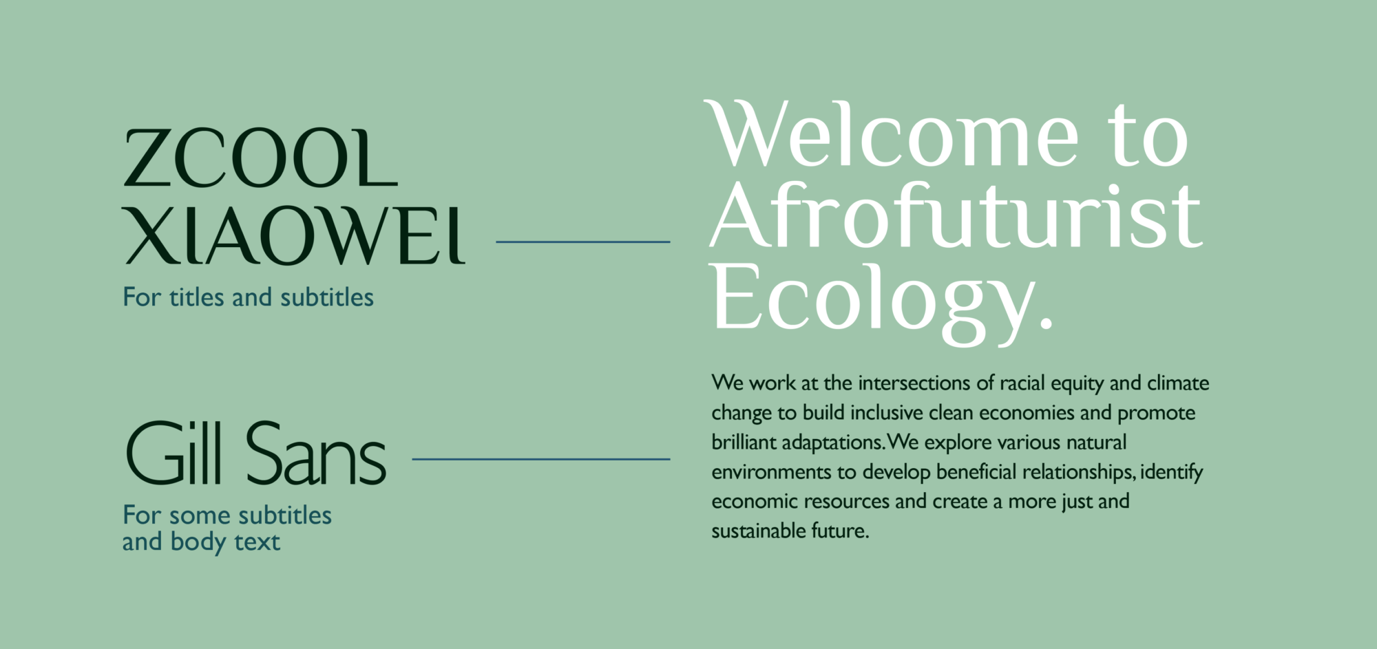
In selecting the typefaces for the brand, we chose ZCool Xiaowel to be used for titles and subtitles and the sans serif Gill Sans for some subtitles and body text. We felt the two typefaces complemented each other and provided excellent legibility characteristics. They are both also included in the Google Fonts library of open sourced font families, which means they are licensed for commercial use, and are available for use in print, on websites, and in apps. As a brand that will be experienced on a number of touch points, these two typefaces will be ideal for consistent branded communications and storytelling.